Problem Statement
Michael Clarke is a STEM major college student who needs to improve his time management skills because his tendency to procrastinate exceeds his motivation to complete assignments. Thousands of students cannot find the motivation to manage their time, and ironically use a lack of time as their excuse. Michael and many other unmotivated college students are in need of a product that would simplify the proecss of time management for them.
Goal Statement
Our idea is to create a product that simplifies the task of time management for unmotivated college students. Therefore we created a scheduling app that will let users create custom schedules and get rewards for sticking to them which will affect unmotivated college students by giving them the motivation and control over schedules. We will measure effectiveness by user retention rates and user feedback.
Problem
We chose to focus our research on the question that would come up the most about how to make our app simpler to use than most task management apps. The answer is in the question, we should use other task management apps to make ours simpler. Before making the app, we have few more areas of research we need to cover.
Research
User Persona
Our User Persona holds every public and personal data on Michael, our choice student, who perfectly fits our target demographic. Every selection of data may be used to improve our prototype applcation in specific ways.
Empathy Map

Our Empathy Map assists us in breaking down our user persona into four main categories: Says, Thinks, Does, and Feels. By doing this breakdown, we become better aligned with our user’s needs and wants.
Insight
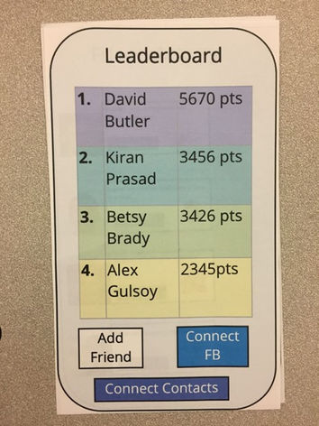
We realized the necessity of creating a sense of community around using the application. Therefore, we chose to add an Activity Log which would allow a user to see their friends’ activities and applaud them for their achievements. This introduces a positive feedback loop where people support one another to achieve their goals. In addition, we included a Leaderboard to introduce a sense of competition and encourage our more competitive users to engage more with the app.
User Journey Map

Our User Journey Map assists us in understanding the (general) journey a user will undergo as they try our application. There are 5 main steps through this journey: Discover, Learn, Use, Connect and Goals. The Discover step is the user discovering our product, the Learn step is where they are learning how to use it, the Use step is using it, the Connect step is connecting with what they want, and the Goal step is them achieving their goals.
User Flow

Our User Flow maps out the various steps and actions a user can take as they use our application. This can be from clicking on the back button to go to the homepage, clicking on the help icon for help and creating an account on the Account Creation page.
Sitemap

Our Sitemap provides a general, eagle-eye view of the flow of our app. While it doesn’t drive into as much detail as the sitemap, it does show the various stages that a user can go through.
We chose to make our prototype using Figma which provides all the basic functionalities necessary for a website to operate properly. We chose Royal Blue for confidence, Off-white (Timberwolf) for simplicity, and Turquoise (Verdigris) for calmness to represent our 10-30-60 color palette respectively. We chose to follow suit with the website, and make all our creative color decisions according to the palette we had all agreed upon. The format of our website takes on the form of many of our inspirations but the inspiration we liked the most is Purva Takkar's Portfolio linked below.
Storyboard

Design
Our Storyboard creates a very rough visual representation of the six main steps : Discover, Learn, Use, Implement, Connect and Goals. Here we draw out what the user does and experiences as they use our application.
Sketches

Connect
Task Manager
Schedule
Homepage
Log In
Our Sketches are our first attempt at drawing out the various designs of the app that the user will be interacting with. From here, we voted using sticky notes to choose our favorite designs.
Most Voted Sketches


The Most Voted Sketches demonstrate which sketches got the most votes and were seen as providing the best experiences for our users.
Solution
Our solution was to create an app that would simplify time management for college students that found themselves unmotivated. We found that the app would have to utilize the effectiveness of other time management apps, but would primarily focus on making the user’s experience as smooth as possible.
Paper/ Lo-Fi Prototype
Our Lo-Fi Prototype is the paper representation of every member's idea compiled into one. We only made the pages essential to the overall logicality of the application. The pages included are: Title Page, Account Creation Page, the Homepage, the Tasks Page, the Task Manager, the Scheduler, the Activity Log, and the Leaderboard.
High-Fi Prototype (Version 1)


Usability
Our High-Fi Prototype Version 1, we designed it off of our Lo-Fi prototype and focused on its functionality and aesthetics. We designed multiple frames: Log In, Account Creation, Homepage, Task Manager, Schedule, Activity Log, FAQ, and a Leaderboard.
Our key takeaway was that various sections of our app were missing basic functionality. For instance, our back buttons were incorrectly sized and placed at different locations on the screen. We also did not have any general navigation buttons to move around in the app; this meant that users had to traverse through the app using the back buttons. Lastly, our help button did not link to a help page.
High-Fi Prototype (Version 2)
© 2023 by Site Name. Proudly created with Wix.com
We could further improve our app by introducing various forms of media to Activity Log, such as photos and videos as well as providing a greater range of responses. This would allow users to post images and/or videos of various achievements such as crushing a midterm or submitting a major project and allow their network of friends to comment on it.
Our High-Fi Prototype Version 2, we based our new design on user feedback and created a much better flow that properly demonstrated a greater functionality of the application. In version 2, we fully utilized the properties of our design software, Figma. We choose to demonstrate this version with a walkthrough video.


